Vbank
Despite Vbank generating lots of excitement through its superb marketing strategies and sleek design, It suffered high user drop-off rates and didn’t retain existing users.
Overview
Project summary: Vbank is a virtual banking app that offers a streamlined digital and mobile banking experience. It gives users access to multiple accounts, swift and secure transfers, bill payments, and money management tools.
Role: UX Writer
How I approached it
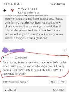
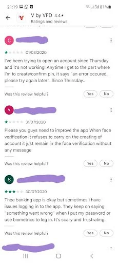
The best way to identify a problem is to listen to the customers.
From Google Play Store reviews to social media interactions, I gathered key insights to uncover the app's core pain points by listening to customer feedback.
After this, I conducted a heuristic evaluation to pinpoint areas of friction within the user flow.
Main Findings
Dead ends within the user flow
Inconsistencies with navigation labelings and terms
User journey
To write meaningful and helpful copy that’s relevant to the customers, I identified the target market and created a user persona.
Based on the information gathered from user research, I went through the product as the defined user persona and experienced the pain points firsthand. This helped me identify what copy was needed, when it was needed, and how it should sound.
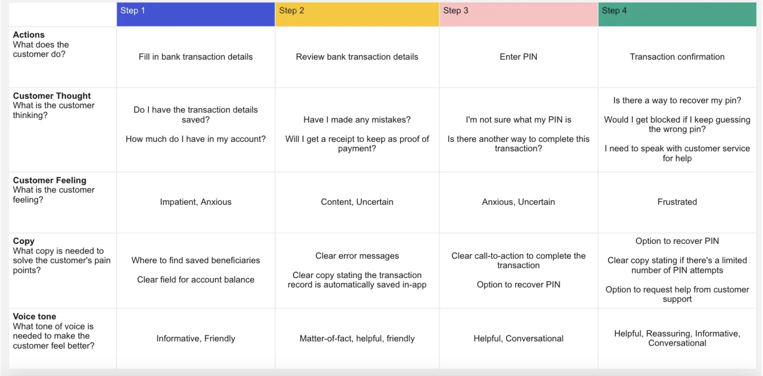
‘Good UX copy is consistent and helpful’
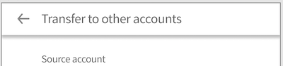
Transfer payment flow
After
Consistent wording
Heading lets people know exactly where they are, and what action they need to carry out
Microcopy
Inconsistent wording
Navigation heading doesn’t communicate what the page is about
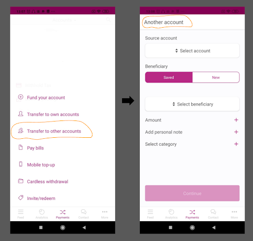
Before
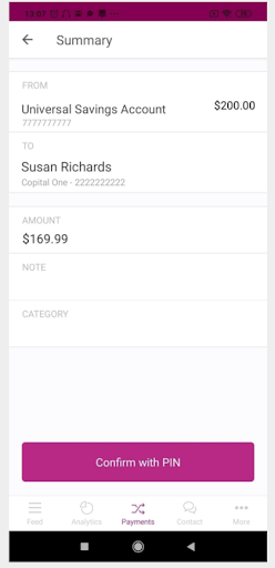
Short helpful copy to put users’ minds at ease
‘Good UX copy anticipates users’ questions beforehand and answers them’
After
Before
‘Good UX copy should help users understand the actions expected of them and guide them to complete it.’
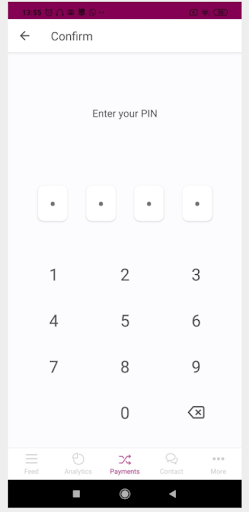
Vague heading
After
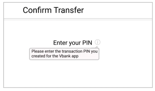
Clear, explanatory heading
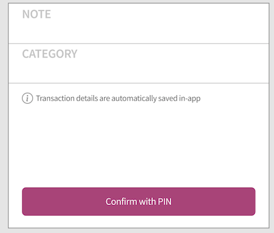
Tooltip that provides extra information regarding the PIN
Before
‘Good UX copy should alleviate users fears, not worsen it.’
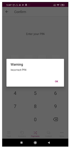
Sounds robotic
Doesn’t offer any help to solve the problem
‘Warning’ and other alarming words incite panic and worsen the user experience
After
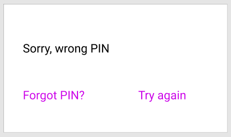
Less robotic
Offers a solution to the problem