TweakMyContent
Overview
TweakMyContent is a content marketing agency that offers personalized writing services for career development, primarily targeting early-career professionals. Despite generating decent traffic from blog posts, the company's website struggled with low engagement, high bounce rates, and minimal to no online sales, which limited the business's growth potential and increased reliance on word-of-mouth referrals.
Role: UX Writer & Content Designer
Goals
The goal was to improve the website to increase conversions. Success would be measured by increased online sales, reduced bounce rates, and improved customer engagement with the blog posts.
Deliverables: Research docs, Information architecture, Content audit, Brand voice & tone guidelines, Microcopy, Website copy
Process
Conducting research to understand the business and its audience
Internal: I started by drafting interview questions and engaging the Head of Content and Manager in one-on-one discussions to understand the business vision, value proposition, target audience, brand, and so on. I also created Google Form surveys to share with the staff to understand their perception of the company’s brand and vision.
Users: Given that the primary target users —undergraduates and young professionals—was similar to the demographics of the staff and my own network, I designed surveys to share among our networks at no cost. From the insights, i found that a significant number used social media such as WhatsApp and Twitter (X) to find career editorial services. So I used Twitter (X) to discover their needs, challenges, and communication style.
Competitors: After working with the marketing team to identify the key competitors, I conducted a competitor analysis, examining their websites, blog posts, and social media presence. This included understanding what content strategy worked and didn’t work for them based on user reviews.
This research phase helped us better define the company's brand personality and create appropriate user personas. In terms of content design it provided the foundation for informing what type of content to create and how to craft them in a way that reflects the brand and connects with users.
Examining the existing website to identify opportunities
Together with the UX designer, I reviewed the existing website’s user experience against Nielsen Norman’s Heuristic Evaluation. I also performed a comprehensive content audit over a two-month period, examining blog posts, media, and website copy using content heuristic checklists, cognitive walkthroughs, and website analytics. I analysed more than 400 blog posts, tagging themes, identifying outdated or high-traffic content, and flagging posts that didn’t align with the brand’s positioning. Working with two content interns, we documented image assets, links, and external publications that had republished our posts, ensuring we kept track of all relevant content.
Our findings from the UX review and content audit revealed major issues such as poor website information architecture, which contributed significantly to high drop-off rates, numerous content dead-ends within blog posts, and an absence of brand personality. There was also no clear CTA to prompt people to buy the services.
In this stage, upon reviewing the website from a branding perspective, I identified a mismatch between the brand’s intended “collaborative” personality and the impersonal ‘cart checkout’ design. This insight fed into the redesign of the information architecture, incorporating the brand personality into the conversion process.
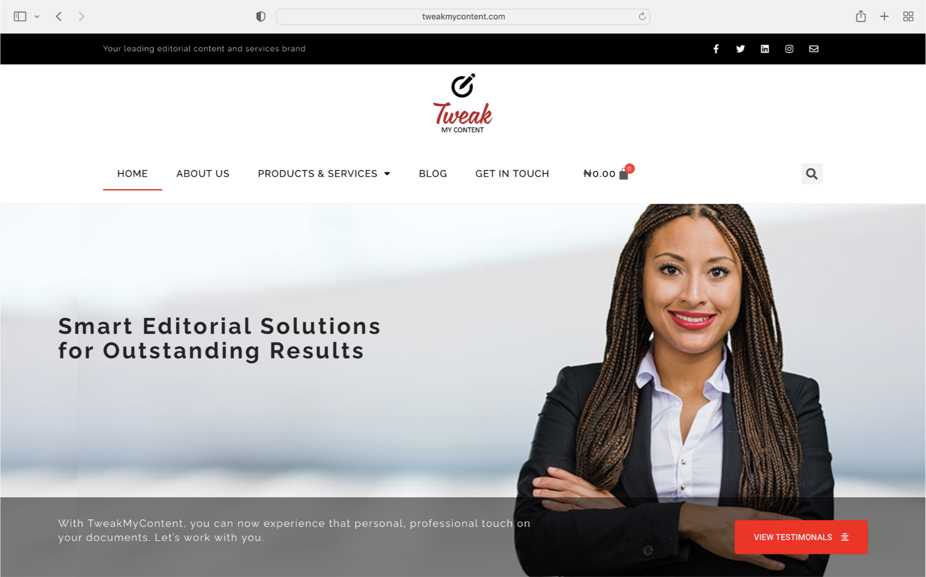
Homepage with impersonal shop feature and primary CTA leading people to download a Testimonials pdf.
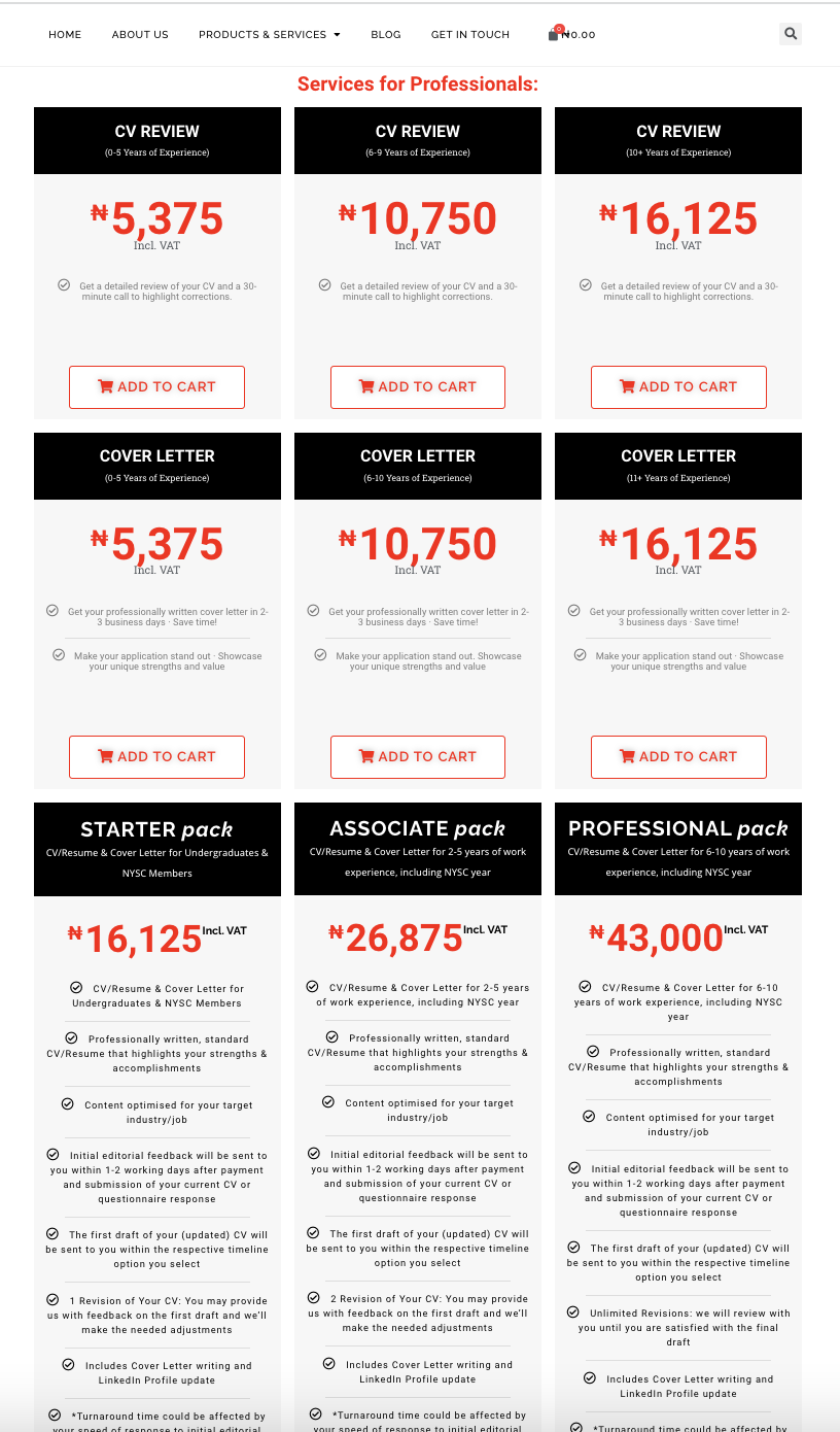
All the 20+ services were ungrouped and shown on a single page.
A multifaceted solution
Given the scope of the issues discovered, the solution required a full website revamp, involving a rework of the information architecture and redesigning all content—from labels and website copy to images—to better reflect the brand and improve user experience.
Building a new information architecture
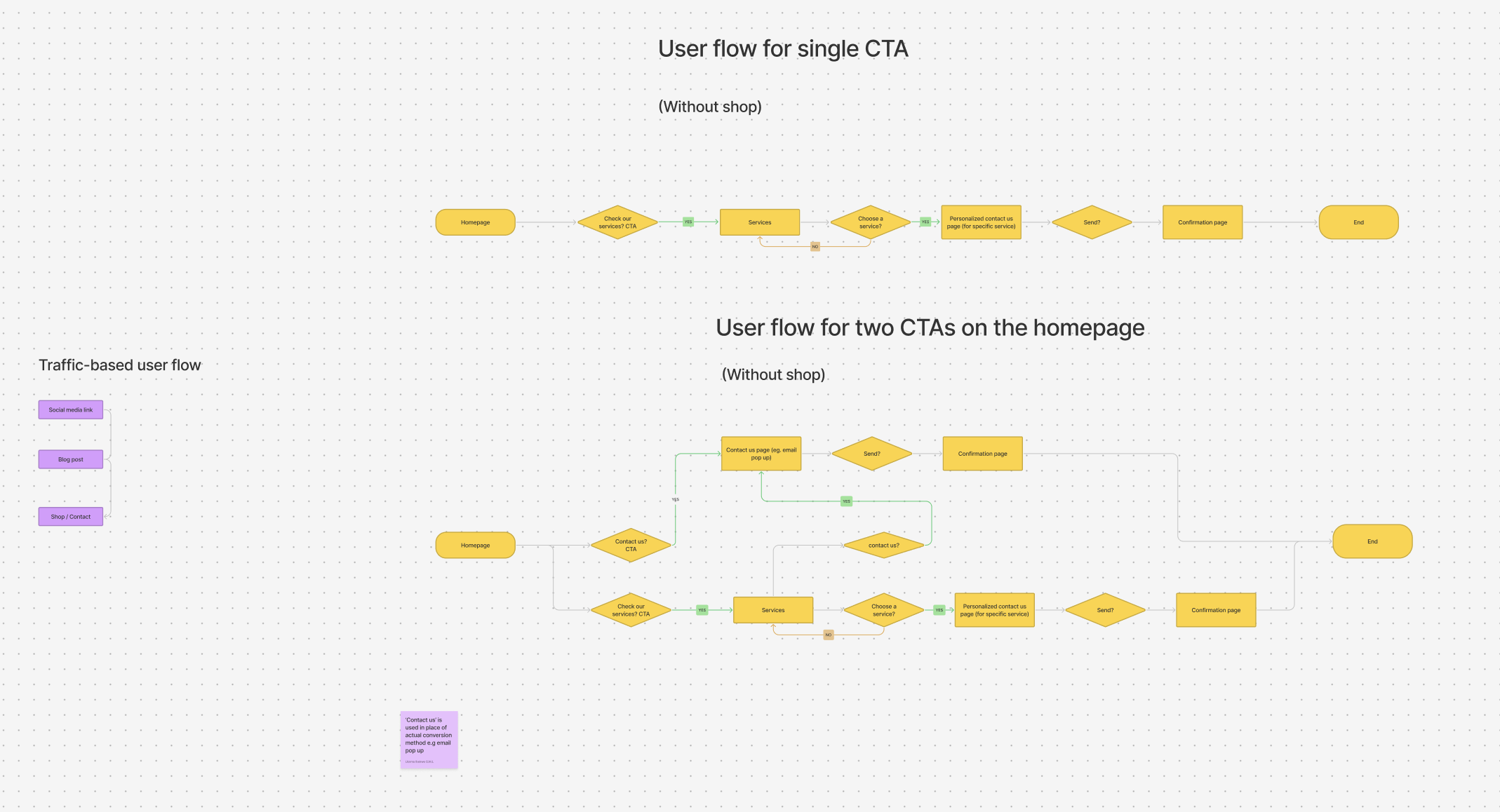
The UX designer and I began by mapping the user flow and journey to visualize the customer experience on the website and across various entry points, including direct search, social media links, and blog posts.
Next, I focused on reorganizing the services page, which initially listed a variety of broad, unrelated services. This lack of structure buried the brand’s unique value and led to content overload, overwhelming users with too many options and complicating navigation. To address this, I collaborated closely with the UX designer through multiple categorization iterations and organized a card-sorting session with the cross-functional team.
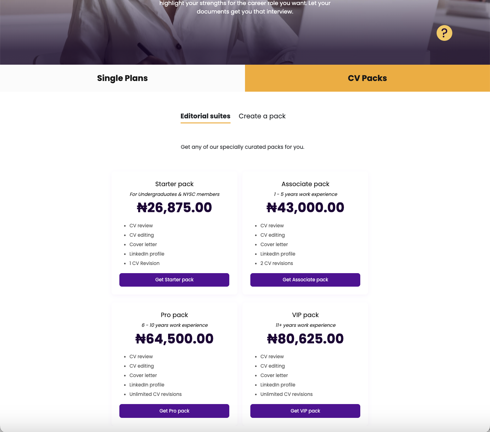
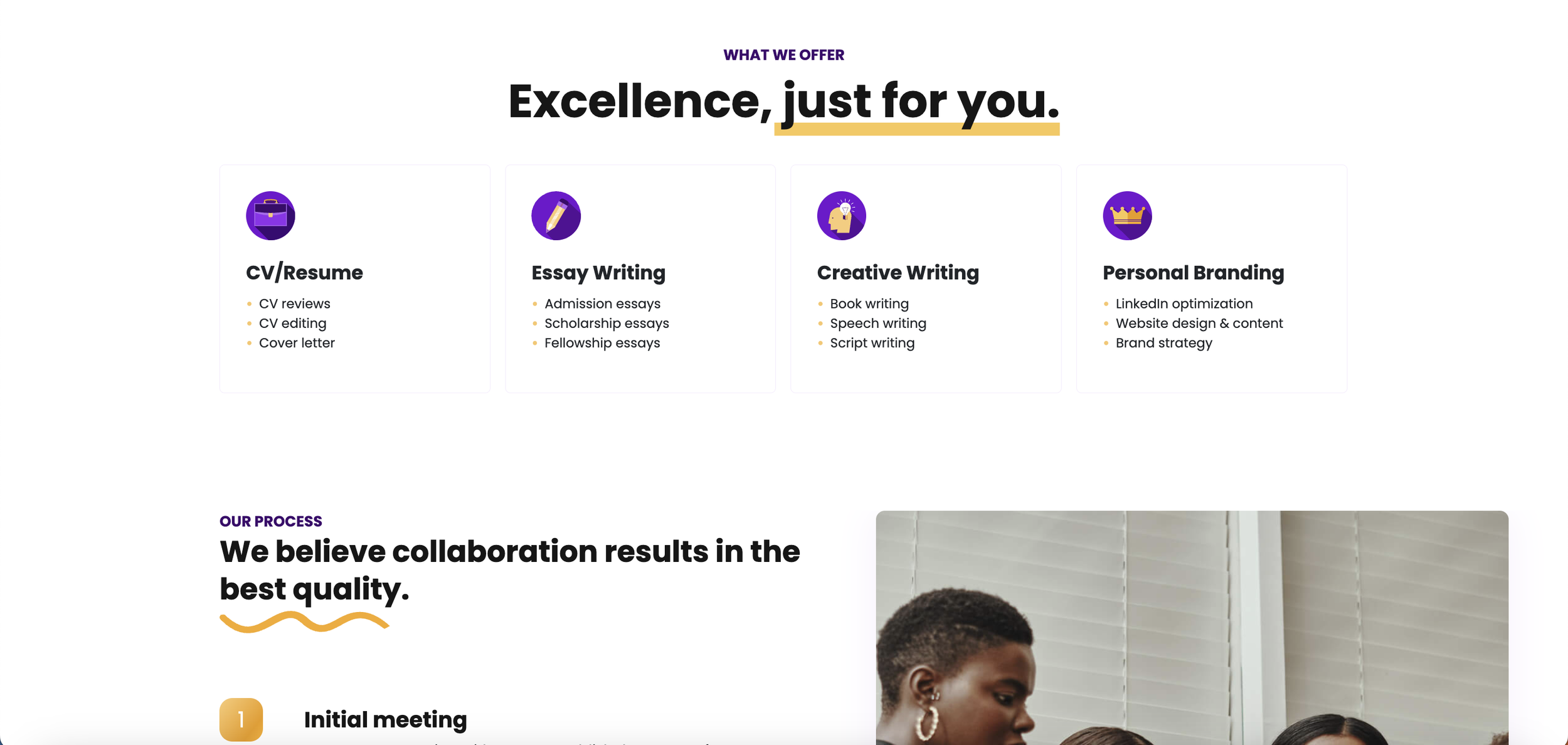
The card sorting helped us intuitively group services to reduce choice paralysis and improve navigation. Services were organized into four categories, each with clearly structured sub-offerings and accompanying CTAs for easy navigation and conversion.
The blog section similarly lacked structure, with posts tagged randomly in the CMS and no defined categories, making it difficult for users to explore topics. I started by meeting with the head of content to clarify the blog’s purpose and KPIs, then researched common topics users were interested in. This helped guide how to group them and the type of new content needed. Using themes identified during the blog content audit, I led another card-sorting session with the content team to organize posts into clear, user-friendly categories, which further fostered a sense of ownership within the team.
During this phase, I identified the need to understand each service offering’s workflow to determine what information to place on the website and where. However, due to the lack of online conversions, I found there was no standardized workflow for online service purchases. To address this, I interviewed staff to understand their work processes from client acquisition to delivery. I engaged all relevant teams in cross-departmental meetings to establish a cohesive workflow. This standardized workflow, combined with insights from the research phase, helped shape the final information architecture. Furthermore, the insights gotten provided a foundation for crafting transparent copy that guides website visitors on what to expect at each stage of their journey.
Brainstorming user flows
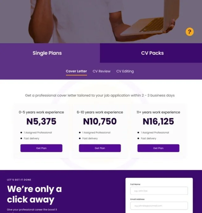
New services page - CV category
Designing content to reflect the brand
The company aimed to position itself as a trustworthy, collaborative partner for its clients. Using user research and insights from the brand questionnaire gathered during the research phase, I further defined the brand voice to reflect honesty, teamwork, and youthful passion. Working with the UX designer, we communicated this personality through the colors, images, and design elements across the website. I also crafted website copy to reflect this personality.
Additionally, from insights gained during the reorganization of the blog section, I developed a content strategy to reinforce the brand’s identity and boost engagement. This included:
Writing and publishing success stories
Publishing guest articles on top industry websites
Interlinking related blog posts
I also introduced personalized, prominent call-to-action taglines within each blog post.
To maximize seasonal trends, I created a content schedule targeting key periods, such as postgraduate application and graduation seasons, to engage our audience effectively.
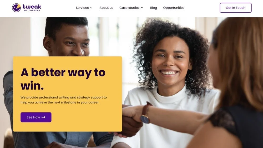
New homepage
Results
Within three months of launching the website, the company witnessed an over 600% increase in online conversions and a steady growth in monthly website sales. There was also a steady increase in website traffic and user engagement on the blog posts. Following the project’s success, the company introduced UX workshops for staff, and I was put in charge of organizing and running them.
Lessons Learned
Given the timeframe for delivering the project and the volume of work, I started writing the UX copy without establishing a complete content style guide to follow, aiming to roll out the first version (V1) of the website and then make adjustments afterward. While I prioritized the voice and tone, I found that making changes for consistency in capitalization and other elements after rolling out V1 was tedious and tricky. Text updates could affect the established design, be undone during design changes, or be missed when going live.
Going forward, I’ve learned to create a style guide for copy that covers not only the voice and tone but also the basics of capitalization, spelling preferences, and other standards before writing.

